1/1/2020
A Blue 2020
Ellen C. Wells
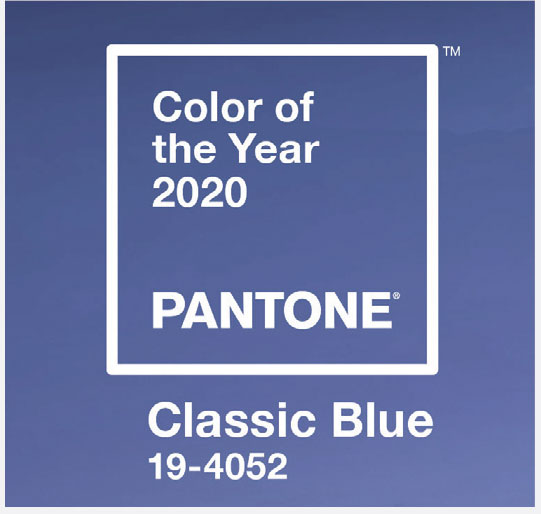
Pantone’s announcement that their Color of the Year for 2020 was Classic Blue didn’t surprise me a bit. Several other color trend forecasts have picked a shade of blue (including the Garden Media Group—good call!). Classic Blue is a pretty blue and one that most everyone enjoys, but it’s nothing extraordinary. It’s the Paul Rudd of color picks this year, while previous years have had a touch of Johnny Depp.
Is it boring and safe? Or is it comforting and classy? Here’s what Pantone’s press release on the 2020 color choice had to say about why this Classic Blue was chosen and what it represents:
“A timeless and enduring blue hue, PANTONE 19-4052 Classic Blue is elegant in its simplicity. Suggestive of the sky at dusk, the reassuring qualities of the thought-provoking Classic Blue highlight our desire for a dependable and stable foundation on which to build as we cross the threshold into a new era. Imprinted in our psyches as a restful color, Classic Blue brings a sense of peace and tranquility to the human spirit, offering refuge. Aiding concentration and bringing laser-like clarity, PANTONE 19-4052 Classic Blue re-centers our thoughts. A reflective blue tone, Classic Blue fosters resilience.”
Other words used by Pantone to describe Classic Blue include “honest,” “protection,” “non-aggressive,” “easily relatable” and “trusted.” In other words, Classic Blue is a simple, grounding color in which we can rest our weary eyes and minds while we behold it. Will Classic Blue be good for the green industry? How can you incorporate it into backyard patios, the houseplant department and maybe the vegetable garden? GP