11/27/2015
Making a Splash This Spring
Jennifer Polanz
In talking with several color experts for this story, it became apparent that colors don’t shine brightly for one year and then burn out to be replaced by new, completely different colors the next year. Instead, they peak and flow into new combinations slowly.
“There’s so much talk about trends every year, there’s become an expectation that this is the new color for this year and then it’s out,” says Kate Smith, color expert and president of Sensational Color, a consulting company. “A trend lasts for four to seven years, so they (consumers) don’t have to be fearful that something they buy will be out next year. It’s going to be around for a while.
“The fun thing with colors is often times it’s combinations that makes a trend. You’ll see two colors together that will be popular in a particular period and you can freshen it up with another color the next year.”
That’s great news for our industry and can help frame the discussion of what’s trending for Spring 2016. In this report, you’ll see some of the same hues we talked about last year with a different twist, while others will be new.
The Color Marketing Group (CMG), an association of color design professionals, sets its color forecasts at least two years in advance with meetings across the globe. Those professionals, from all different industries, bring their colors to the conferences, so the forecasts are driven by those meetings. For example, Spring 2016 colors were forecasted at meetings in 2014 and the consensus was focused on several shades of green.
“Indeed, there are a lot of people who have brought these greens to the table,” says Judith Van Vliet, vice president of public relations and communications at CMG.
It’s not just the colors that matter, too. It’s the finishes, and for next year, Judith sees matte coming to the forefront, as well as metallic finishes.
“We’re generally seeing for 2016 and onward is in the matte direction, and metal effects. We see a lot of anodized effects coming back. It used to be only in the automotive industry, but now we see this is cross-segment,” she says. “So matte is definitely an important direction.”
Kate also is seeing metallics in finishes and adds that mixing metallic is popular, such as mixing copper with silver and gold or pewter with rose gold.
There’s lots of opportunity for bringing colors and trendy finishes into the exterior living spaces, too, says Jackie Jordan, director of color marketing at Sherwin-Williams.
“There has been a trend over the past few years to bring the indoors out, meaning our outdoor living spaces are as stylish and comfortable as our indoor spaces,” she notes. “This means that color options are more plentiful for outdoor spaces and the selection of outdoor furniture and accessories is abundant.”
One final note before we dive headfirst into the color forecasts: there’s a definite trick to incorporating the “it” colors into the retail setting. In fact, it’s something Kate specializes in and she recommends picking a few colors to focus on and use others as accent pieces.
“Don’t feel the need to use every color—just like we would in decorating and graphics, you choose one or two that you’re going to highlight,” she says. “Choose a couple to make big impacts and bring the others in in other ways.”
Color Marketing Group
The forecast for exterior color trends in 2016 has a lot of greens involved, which can be a double-edged sword for our industry. Many of our products already fit the bill, but too much green or not the right green can backfire. Judith says they’re seeing a muddy, darker yellow-tinted green, reminiscent of military colors, as well as greens that have a hint of black in them. These aren’t clean colors, but muddy and mossy.
Along with the greens, they’re also seeing a sage color in a matte finish that takes up where the pastel mint left off the last two years. “It could be very interesting this sage color,” Judith notes. “It’s used a lot in the kitchen.”
CMG also established “Uni-blue” as its key color for North America for 2016. This blue “represents the continuum that connects space, people and ideas, not only in life, but in color,” according to a description, which adds, “Uni-blue is a deep chromatic blue highlighting the transition from cobalt blue to a blue of deeper substance.”
While for interiors teal is still somewhat popular, outside is left to more earthy tones, like extremely dark oranges. “It looks like rust and fits very well for gardening and the exterior,” she says. “Whether this could be seating or in planters; in the garden you see a lot of brickwork and this is exactly the type of oranges we’re talking about.”
Last year we mentioned dusty pinks, and those remain in, as well as some coral colors and bright fuchsia, Judith says.
Find out more about Color Marketing Group at their web page,
www.colormarketing.org, and find them on Pinterest, Instagram, Twitter and Facebook.
Behr Color Trends
I wanted to include a mix of interior and exterior color trends, since we deal with both in our industry. From Behr’s Color Trends Collection, a new series of paints coming out next year, the palettes show lots of contrasting colors, tactile elements and matte and glossy finishes, depending on which grouping it’s in. We can’t show them all here, but visit
www.behr.com to see the full collection.
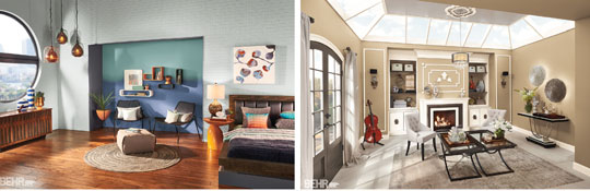
Pictured left:
Blurred Boundaries: This grouping is described by Behr to be modern styles softened with organic shapes, subtle color combinations and natural materials (sound familiar?). The colors at work here are Celadon, Modern Mint, Stratus, Raw Copper and Charcoal Plum.
Pictured right:
Lyrical Living: Here we see more earthy colors and accents, as well as reflective surfaces. The colors here are Symphony Gold, Ivory Keys, Mauve Melody, Bowstring and Opus.
Kate Smith, Sensational Color
Kate says the palette she’s seeing for 2016 is also based in earthy tones. For example, a warm, bold, earthy red (she cites Benjamin Moore’s Ravishing Red) and an earthy, vibrant gold. She’s also seeing a toned down bluish-green that’s not quite the popular teal we’ve been seeing for a while and a mossy green for the outdoors (here she cites Benjamin Moore’s Courtyard Green).
“These are all colors that have an organic feel to it, which is why they work so well with the outdoors,” she says. “They can work well with neutrals and the metallic finishes.”
There’s another group of colors that has caught her eye, particular for outdoor spaces, and those are dynamic neutral colors. One is almost between charcoal and dark brown and she cites PPG’s Black Walnut color as a prime example. To complement that, add Lazy Afternoon, which is between gray and brown, and Paradise Found, an aloe green that is PPG’s color of the year for 2016.
Sherwin-Williams
Jackie worked with color experts in the company to determine 34 colors that make up the 2016 forecast, which is represented in the Colormix 2016 collection. We’ll highlight two of the groupings here and you can find the rest at
www.sherwin-williams.com under the Inspiration tab.
Mas Amor Por Favor: This grouping stresses a meaningful life that begins close to home, driven by in-person social engagements like gatherings, garden parties, personalized outdoor weddings and more. “Mas Amor Por Favor can be interpreted easily for outdoor spaces,” she notes. “Bright glazed ceramics for potted plants, lots of bright and light pinks, yellow and bright greens for flora and fauna. Furniture with bright floral patterns in these colors, as well as painted furniture makes this trend sing.”
Colors here include: Charming Pink, Juneberry, Memorable Rose, Van Dyke Brown, Transy Green, Kind Green, Different Gold and Friendly Yellow.
Nouveau Narrative: Everything small batch is in, and this grouping celebrates the return of skilled labor and an appreciation for quality craftsmanship. “The colors of Nouveau Narrative reflect the rugged determination of the American spirit with olive, denim, dusky wools and brass,” Jackie says. “The new industrial revolution may be small production, but it is built to last.”
Colors include: Urban Putty, Crabby Apple, Naval, Morris Room Grey, Relic Bronze Metallic, Aleutian, Backdrop, Roycroft Pewter, Renwick Olive and Well-Bred Brown.
GP