9/30/2026
Adapt or Die: Your Store is Your Silent Salesperson
John Stanley, Sid Raisch & Dries Jansen

One of our most powerful sales tools is often silently ignored: the store layout. Retailers spend considerable time and money choosing products, negotiating with suppliers, training employees and promoting their businesses, while profits are lost in unplanned wandering of customers through their stores.
A good layout does much more than guide customers from entrance to checkout. It creates curiosity, makes shopping easier, exposes customers to a wider assortment and turns a necessary purchase into an enjoyable experience. The best layout will yield better results. A poor layout creates confusion, hides profitable categories and sends customers not only back to their cars sooner than planned, but also to other retailers. If customers need to ask where the outdoor plants, restrooms or checkout are, the facility isn’t communicating clearly enough. If they enter and leave with one bag of soil without seeing anything inspirational, the layout isn’t working smartly enough. If seasonal changes require weeks of moving fixtures and products, the layout isn’t flexible enough.
Start With the Customer, Not the Building
Store planning often begins with a floor plan. It should begin with the customer. Why are they visiting? What do they need? What might they also buy? Where should they slow down and where should they be able to move quickly?
The answers determine the layout. A customer buying a barbecue may also need fuel, tools, outdoor furniture, tableware and plants for the entertaining area. Someone buying a houseplant may be interested in a decorative pot, plant food, a watering can or a gift. These relationships should be visible. When related products are separated by long distances, it creates work for the customer and loses additional sales.
The best layouts connect customer missions with commercial opportunities. They make the logical purchase easy and are tempted into additional purchases. And they don’t wear the legs off the staff.
Stop Confusing Traffic With Customer Flow
Customer flow must feel natural, yet clear, without becoming a box store racetrack. Strong sightlines reveal what lies ahead. Displays along the way create reasons to pause, explore and return. Customers need freedom to take shortcuts, return to a department and move between indoor and outdoor areas without feeling trapped.
The aim is guided freedom: an effortless journey to the customer and commercially planned by the retailer. This balance is important. Force customers through every department and they may become irritated. Give them a direct line from the entrance to the checkout and many will ignore most of the store.
The entrance is particularly critical. It’s not the place to display everything at once. Customers need a moment to adjust, understand the environment, get their mind into the seasonal theme and decide where they’ll go. The first view communicates the season, the brand and the promise of the visit. It says, “There’s something worth discovering here.” Enter with plants, exit with plants.
A Purpose For Each Space
Retail space is expensive. Yet stores contain many dead corners, oversized pathways, weak transition zones and displays are unchanged for years. These spaces may look harmless, but together they represent a significant amount of lost revenue.
Every square foot has a role. Some areas generate revenue. Others inspire, provide service or support the experience. Even an inspirational display must earn its place by encouraging customers to buy, explore and remember the store.
Empty space is intentional customer space and shouldn’t be stuffed with overflowing products. More stock on display doesn’t automatically create more sales; more turnover of the right products does. In fact, overcrowding does more than restrict flow—it’ll often lower perceived value, making decisions more difficult. The objective is not density, it’s more revenue.
Retailers should compare the space allocated to each department with its strategic importance: margin, stock turn and revenue. The solution may be to reduce or remove a product line, adding more space where performance is earned, a better location, a different assortment or a complete rethink of the presentation.
Layout decisions should never be based only on habit or the opinion of the loudest person in the meeting. Data provides the evidence; creativity determines what to do with it.
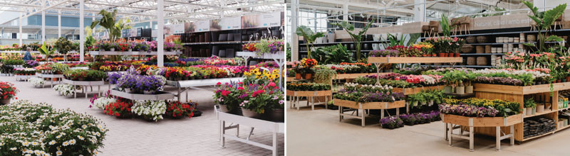
The new Fronda location near Barcelona, Spain, is a great example of creating a customer shopping journey with intention.
Design for Change
Garden retail is highly seasonal, but many garden centers have inflexible layouts. Spring arrives, Christmas follows and the store is repeatedly rebuilt through improvisation.
A modern layout must be designed to change quickly. Seasonal zones expand, contract and preserve the customer journey. Movable and adaptable fixtures are valued for more than the cost alone. Power, lighting and signage systems support multiple uses. Transitions from spring to outdoor living, and from autumn to Christmas, should be planned for the next year even as the current season progresses.
Fronda, Barcelona: Turning Strategy Into a Store Layout
The new Fronda garden center near Barcelona, Spain, is a practical example of these principles. It began with a desired customer journey and the commercial role of each department. A layout was developed with intention, not by simply filling the space available with products.
Hotspots are integrated at strategic positions along the main route. These aren’t random displays or decorative interruptions. They create moments of inspiration, communicate the season and encourage customers to stop before continuing into the next department. By changing the content of these hotspots quickly from season to season, Fronda keeps the journey fresh.
Outdoor plants are positioned alongside outdoor pots and relevant seasonal ranges. The layout is focused on having the right products in the right place. Indoor plants are connected with indoor pots, decoration and gift products. These adjacencies help customers complete a project rather than buy only a single item. They make the store easier to understand because the product relationships follow the way customers think.
Seasonality was an important consideration. Garden retail space works differently in spring, summer, autumn and Christmas. At Fronda, flexible zones allow seasonal categories to expand and contract while the main customer route and permanent departments remain clear. Seasonal change becomes part of the layout strategy rather than a disruption of it.
Finally, the right balance between departments is achieved: Space allocated according to the size of the assortment, and according to expected turnover, margin, customer demand and the strategic importance of each category. The resulting layout is inspiring and convenient, and its performance supports one another.
While competitors repeat the same layout year after year, progressive retailers test new adjacencies, measure customer movement and create seasonal experience zones.
Layout Must Express Your “Onliness”
A technically efficient layout isn’t enough. Supermarkets and big box stores are also efficient. Independent garden retailers need a layout that expresses why their business is different—their Onliness—not an add-on to a hardware box.
If your Onliness is providing expert plant knowledge, make advice visible and place specialists where customers need them. If it’s local production, show the growers, the seasons and the story behind the plants. If it’s a family experience, integrate play, food, education and discovery into the journey rather than placing them in leftover spaces. If it’s outdoor living, create complete settings that customers can imagine at home.
Your layout will make your strategy visible without requiring an explanation.
The future garden center won’t be defined by the number of products or the size of its greenhouse; it’ll be defined by how intelligently it connects products, people, services and experiences.
Walk through your store as if you’ve never visited before. What do you see first? Where do you hesitate? Which departments do you miss? Where do you feel inspired and where do you feel tired? Then look at the data and ask the harder question: Is your layout helping customers buy or merely giving products somewhere to stand? GP
You can reach the authors at the following emails: John Stanley at info@johnstanley.com.au; Sid Raisch at sid@advantagedevelopment.ai; and Dries Jansen at info@gardencenteradvice.com.